Print design is an age-old art that has evolved through the centuries, weaving aesthetics and practicality into the fabric of our daily lives. Print design endures, offering a tactile form of visual communication. For graphic designers and print enthusiasts, the choices made when it comes to typography and color selection are pivotal. They can transform a lifeless canvas into an engaging, meaningful piece that resonates with its audience. Let's explore the intricacies of these elements and how to wield them effectively in your next print design endeavor.
Typography in Print Design
Typography is more than just choosing a font; it's about expressing the content in a way that complements the message. Whether it's a bold header that demands attention or a body text that whispers, the typeface alone can set the tone for the entire design.
Why Fonts Matter
Fonts are the voice of your design. They can give content a historical or modern feel, a playful or somber mood, and can even imply motion or stability. Serif fonts may evoke tradition and formality, while sans-serif fonts speak to contemporary simplicity. The selection of font is important, as it conveys a brand personality. For example: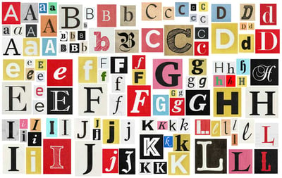
-
Script fonts: convey elegance and sophistication.
-
Display fonts: exude creativity and uniqueness.
-
Monospaced fonts: suggest order and structure.
-
Handwriting fonts: bring a personal touch and informality.
-
Decorative fonts: showcase creativity and artistic flair.
Readability and Message Delivery
The readability of a piece can make or break its message. Balancing font size with line spacing is crucial. A general rule is to keep the main body text between 9 and 12 points with a leading of 120% of the type size for optimal legibility.
Best Practices
-
Choose fonts that adhere to the aesthetics of the message.
-
Utilize font consistency to establish a visual hierarchy.
-
Avoid using too many font families within one design.
-
Remember that less is often more: prioritize elegance and simplicity.
Implement these practices, and your typography will not only be seen, but it will be heard.
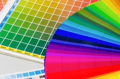
Color Selection in Print Design
In the realm of print, colors hold a significance that goes beyond visual appeal. They can evoke emotions, elicit responses, and build brand recognition. Understanding the nuances of color is essential for creating impactful designs. Every color has a story to tell. Reds may signify passion or urgency, blue can invoke a sense of calm or trust, and yellow often represents cheerfulness and warmth. These associations can influence the viewer's perception.
Color Psychology in Print Design
Color psychology is about leveraging those associations to guide the viewer's emotions. When designing for a specific purpose or audience, choosing colors with intention is key.
In the dynamic landscape of print design, certain color schemes have risen to prominence, each carrying its unique emotional undertone or brand persona. Here's a glance at some of these popular palettes and the messages they convey:
-
Monochrome & Neutral: Utilizing shades, tints, and tones of a single hue paired with neutrals, this scheme evokes minimalist sophistication and balance. It suits brands aiming for elegance and understated confidence.
-
Bright & Bold: Combinations of vibrant colors, such as deep blues with electric yellows, signal energy, innovation, and forward-thinking. Ideal for youthful, adventurous brands.
-
Pastel Palettes: Soft, desaturated colors like baby blues, light pinks, and gentle yellows convey a sense of calm, innocence, and serenity, perfect for wellness and baby products.
-
Earthy Greens & Browns: This scheme draws from nature, suggesting stability, growth, and eco-friendliness. It's a match for brands focusing on sustainability and natural products.
-
Contrasting Complements: Pairing colors directly opposite on the color wheel, like blue and orange, creates high energy and vibrancy. It's the go-to for brands wanting to make a bold, dynamic statement.
-
Warm Reds & Oranges: These colors can create a sense of warmth, excitement, and appetite stimulation. They're often used in food industry branding and for products seeking to evoke passion and enthusiasm.
Understanding the emotional impact of these color schemes allows designers to craft print materials that resonate deeply with the target audience, further enhancing the message and the overall brand experience.
Tips for Effective Color Selection
-
Keep the print context in mind; colors can look different on screen compared to paper.
-
Use color contrast for readability and to emphasize hierarchy.
-
Aim for a color scheme that remains harmonious when printed in grayscale.
Staying mindful of color choices ensures that every hue contributes meaningfully to the narrative of your design.
Combining Typography and Color
The fusion of type and color can be a harmonious symphony in your print designs. When these two elements work in concert, they can elevate the visual experience and create a memorable piece that lingers in the mind of the viewer.
Harmonizing Type and Color Choices
Balance is key when combining different typefaces and colors. Use contrasting colors for headlines against a subtle background. Employ analogous colors for a cohesive, monochromatic look. And ensure that the text remains legible, no matter the color or background it's placed upon.
Study renowned print designs to learn how masters of the craft have brought typography and color together. The New York Times Magazine covers, with their bold, serifed headlines juxtaposed against striking photographs, are a classic example of effective integration.
Practical Tips for Print Designers
To excel in the domain of print design, a good eye for aesthetics must be coupled with practical skills and resources. Here's how you can take your typography and color selection to the next level.
Optimizing Typography
-
Learn the difference between typefaces, fonts, and the terminology of typography.
-
Understand kerning, tracking, and leading to fine-tune your type.
-
Explore the world of web fonts that can now be used in print through modern-day printing technologies.
Tools and Resources
-
Utilize software with robust type capabilities, such as Adobe InDesign.
-
Experiment with online platforms that offer a range of fonts and color palettes, like Google Fonts or Adobe Color CC.
-
Invest in resources that provide in-depth knowledge of typography and color theory, such as printed guides or online courses.
By continually honing your skills and staying abreast of the latest practices and tools, your print designs will always be on the cutting edge.
Typography and Color: Perfect Dance Partners
Typography and color are the building blocks of successful print design. Their selection requires consideration not just for the aesthetic appeal, but also for the message they convey. Tactfully combining these elements is the hallmark of a skilled print designer.
In the grand narrative of design, each project is a new chapter waiting to be written. The choices you make with typography and color will define the story you tell. With each stroke of the pen or click of the mouse, remember that print design is art steeped in tradition but propelled by innovation. Now, it's your turn to carry that legacy forward with your unique vision and thoughtful selections.
For those who venture into this captivating world of print, remember to explore, experiment, and, above all, enjoy the process. Your next masterpiece could be just an inspired font or a daring color choice away.